Optimised for mobile, tablet, TV, laptop, desktop.. a fully responsive website will look great on them all.
Make sure you have a design that works for you.
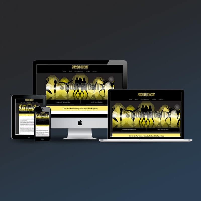
Hornet Creative builds websites that respond to the viewers device screen size and display beautifully.
Great looking websites… everywhere
You’ll probably have noticed how many websites now display things differently on mobile devices compared to a desktop computer layout.
There’s no need to zoom in to read the text and see images as the page content containers change position and shape, that’s responsive web design… and you need it for your website.
Responsive Design is not just better for visitor experiences, but will also help your site appear higher on Google!
When choosing where page links appear in search results, Google now gives more importance to websites that are optimised for mobile, especially when the search is taking place on a mobile device.
So if your site doesn’t scale well, or at all, for smaller screen sizes, you’re likely to be loosing out on potential site visitors.
Get in touch to find out how Responsive Design can work for you and your website.
What is a responsive website?
A responsive website, or responsive layout, is a website that will change width and appearance depending on the device or screen size it is being viewed with. It has a fluid layout that can adapt to different screen sizes.
Another term for this is “optimised for mobile”. Rather than forcing the site visitor to zoom in on their smart phone, they will only have to scroll down as the contents have been resized and reordered to make viewing easier.
Most websites you find online are now developed in this way, allowing simple scrolling to access more content and read more information.
You may have begun to notice the older sites, they will be the annoying ones where you have to zoom in just to read some text!
Why have a responsive layout website?
As mobile devices, phones and tablets are overtaking desktops and laptops as the popular devices for accessing the web, it is more important to provide the information visitors are looking for as simply and quickly as possible. By removing the need to squint their eyes and zoom in, by implementing a responsive layout, your site could already be one step ahead of your competition.
In addition to a great visitor experience, you will also be higher in Google searches. Mobile optimised websites are favoured by Google and other search engines when the search is taking place on a mobile device.
With mobile use and searching on-the-go increasing rapidly, this means you’ll have more chance of capturing the attention of your target customers, wherever they are!
Contact Hornet Creative to discuss how best to reach more of your potential customers.

